Quentier UI changes and panel style configuration
Jan 7, 2020Today an update rolled out for stable branch of Quentier which some noticeable changes in the app’s user interface:
- panels look quite different than they used to
- the app’s default icon theme has changed
- the app’s has a brand new logo now
Here’s how Quentier’s window used to look before:
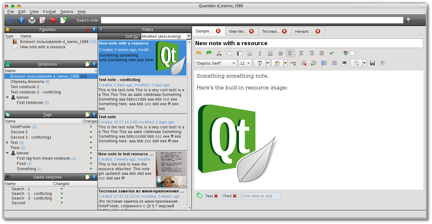
This screenshot was taken in late 2017 when Quentier first went public. At that time customization options for user interface were very limited: one could choose between Oxygen and Tango icon themes and one could choose between three hardcoded styles for panels: the default gray gradient, flat light gray color or flat dark gray color. It wasn’t much useful probably but at least it was something.
The just rolled out version of Quentier looks somewhat differently:
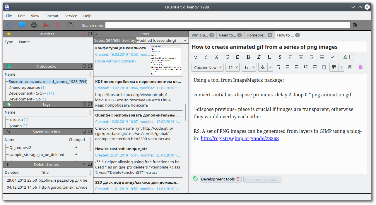
As one can notice, on this screenshot the app uses breeze icon theme, panels background is not flat gray by default and the app has a brand new logo. The logo is a courtesy of Alex Potterson, a designer I found on Reddit who volunteered to create a nice modern logo for Quentier. Thanks Alex!
Two new icon themes were added to Quentier in this update: Breeze and Breeze dark. If you like Oxygen or Tango more or if you used your DE’s native icon theme, you can still continue using them. But now Quentier would default to using Breeze icon theme is light DE theme is used or to using Breeze dark icon theme otherwise. I.e. Quentier would try to guess whether your DE’s theme is light or dark. If it fails to guess correctly, you can just set the desired icon theme manually.
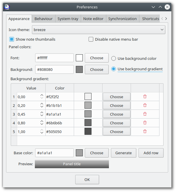
Finally, the panels part. They are now flat now by default but there is a simple way to customize their look. To look at it, open the preferences menu:
Preferences dialog would show up with its default “Appearance” tab:
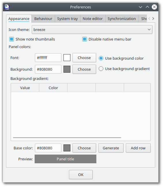
This menu used to contain “Panel style” combo box via which one could choose between three hardcoded options but it is no longer available. Instead, a whole new set of fields is here:
- Panel font (foreground) color fields. There’s a line edit where you can see and enter color code, there’s a small quad demonstrating the currently used color and there’s a push button to open the color picking dialog (you can double-click the quad instead of single-clicking the button if you like).
- Same fields for panel background color.
- To the right of these there’s a switch between using flag background color or using a gradient. If you press it now, it would reject to switch and complain than no gradient is set up. That’s what fields to the bottom are for:
- Background gradient table. This table is meant to contain lines with values and colors that form the gradient.
- Add row button to the bottom right of the table adds rows to the table so you can edit values.
If you’d like to have gradient background for panels but you don’t feel like entering values and choosing colors for several lines manually, the following fields are here to help:
- Base color. This is the “middle” color for the gradient you’d like to have.
- Generate button which creates the gradient from the single selected middle color.
The preview field on the bottom of the dialog shows how the panel would look with all chosen style options.
After you set up the gradient, you can switch the radio button from using flat color. It can look like that:
Quentier’s main window with gradient set up this way would look like this:

You don’t have to use gray scales, you can pick any colors you wish.
Panel colors are stored persistently and thus the next time the app starts up it picks the colors you have chosen the last time. Panel colors are stored separately for different accounts which makes it possible for you to set up panel colors differently for different accounts and hence be able to easily differentiate them visually.